

Client:
Muzeum Wsi Opolskiej w Opolu
Year:
2022
Designers:
Natalia Jakóbiec, Katarzyna Pełka-Bura, Marcin Krater, Karolina Wiśniewska, Magdalena Giertuga, Nicola Rajda
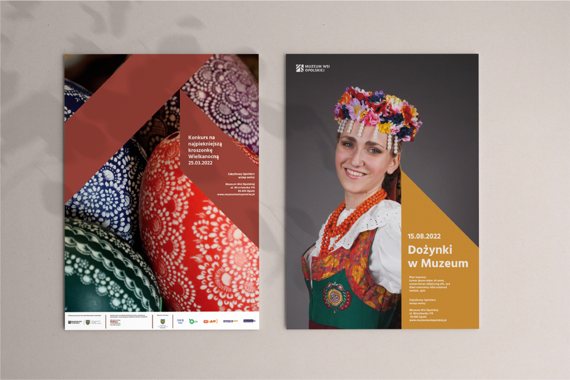
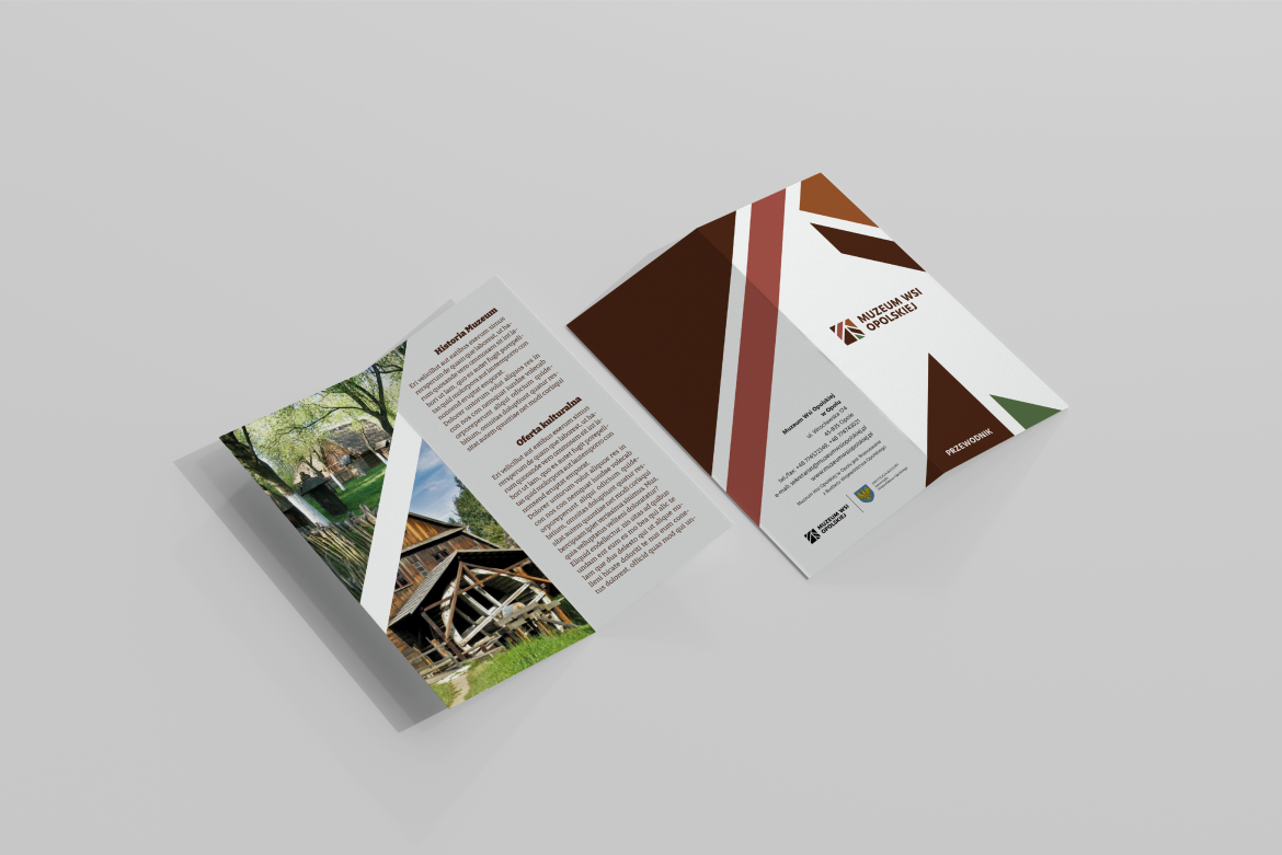
The new identification of the Museum of the Opole Village in Opole consists of a logotype with a book of signs, design of guides, business cards, posters and other media needed for everyday functioning. It was also used as the basis for the publication and poster design for the project "The voice of fish" and the website.
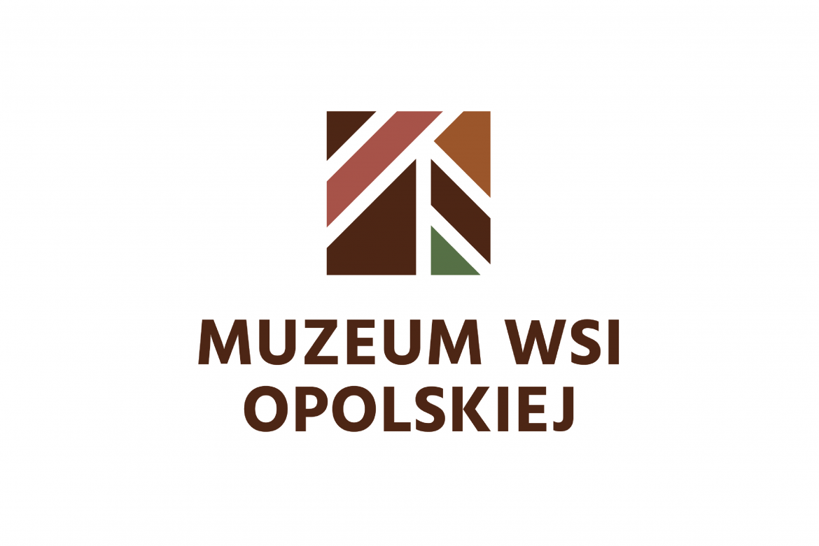
The main inspiration for the new logotype was the architecture of the museum buildings and the wooden structure and characteristic formwork of the buildings. The signet ring is closed in the form of a square – it is simple and modern.
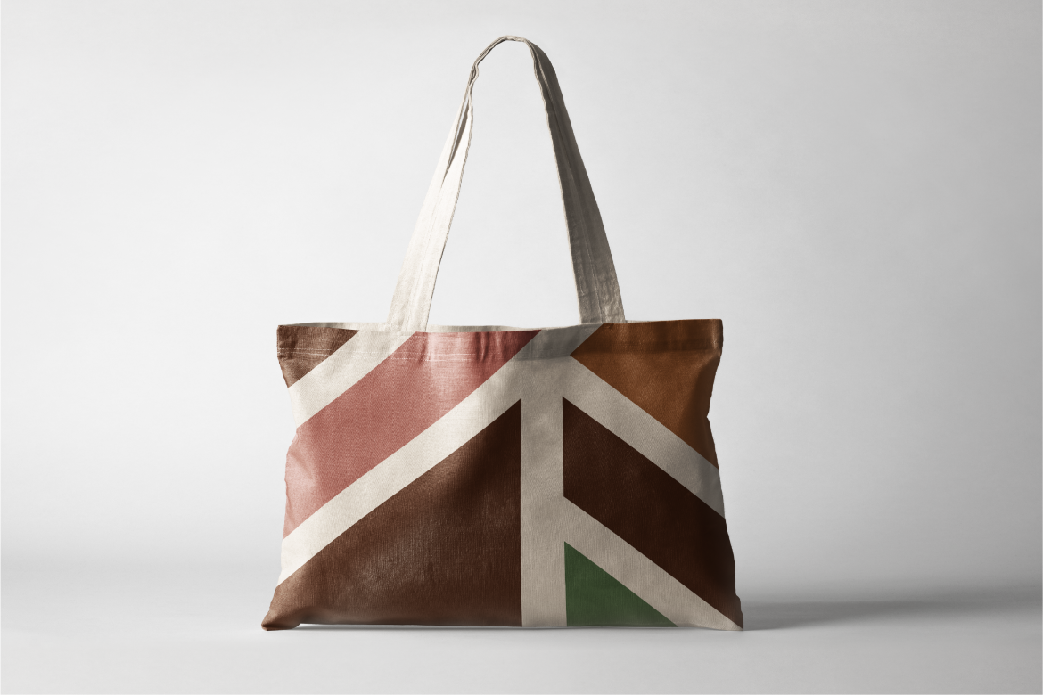
An important element of the new identification is the color palette. Four basic colors appear in the color version of the logo - two shades of brown, green and pink referring to the countryside, folklore and nature. In addition, an extensive color palette has been selected, which allows for the implementation of identification as part of the Museum's various initiatives.
The need to change the logotype resulted in other, consistently introduced modifications. Together with the logotype, a complete book of visual identification was designed. An important aspect was the development of a modular system based on the logo signet grid, which allows for a varied, but systematized development of promotional materials.
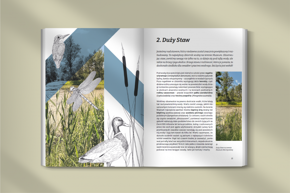
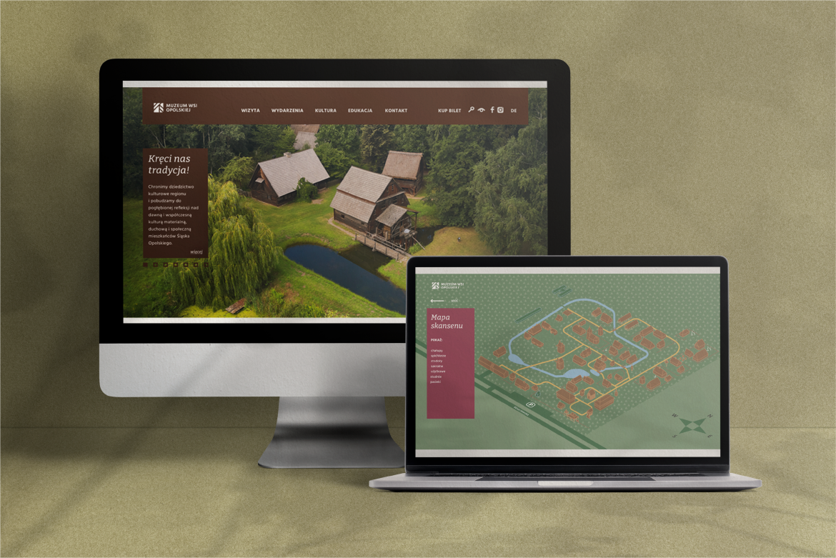
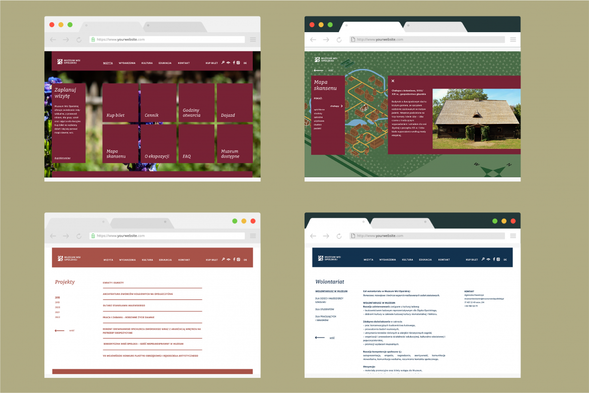
The next element, which has been designed according to the principles of the new identity, is the institution's website. As a result of the analyses, a new layout was created that focuses on impressionability, but above all on functionality and accessibility. An important element of the website is also an interactive map, which allows you to get to know the objects located in the museum. A synthetically prepared map was also used in the guide and on the boards located in the museum.
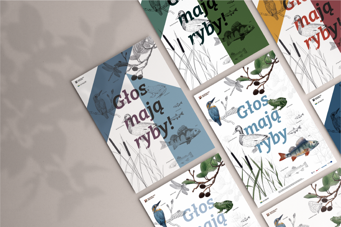
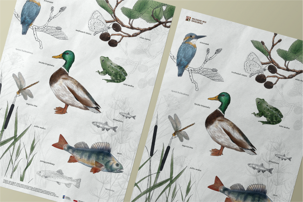
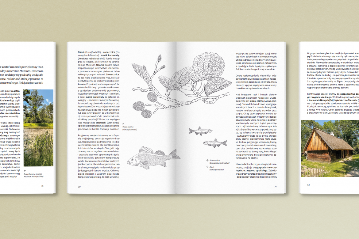
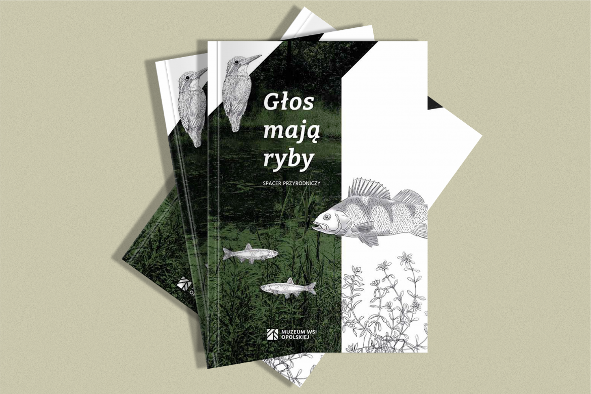
According to the guidelines of the new visual identity, the materials accompanying the project entitled "Fish have a voice." It was a guide to a nature walk developed as part of the initiative and an educational poster. New ones have been added to the already fixed, geometric graphic elements resulting from the new identification. Hand-drawn, linear, organic illustrations perfectly complemented the basic design and emphasized its universality.