
Client:
Muzeum Narodowe w Krakowie, Galeria Sztuki Polskiej XIX w. w Sukiennicach
Year:
2022
Designers:
Natalia Jakóbiec, Marcin Krater, Katarzyna Pełka Bura, Karolina Wiśniewska, Marta Żmija-Wojciuch, Anna Dudziak
Photo:
Radosław Kaźmierczak
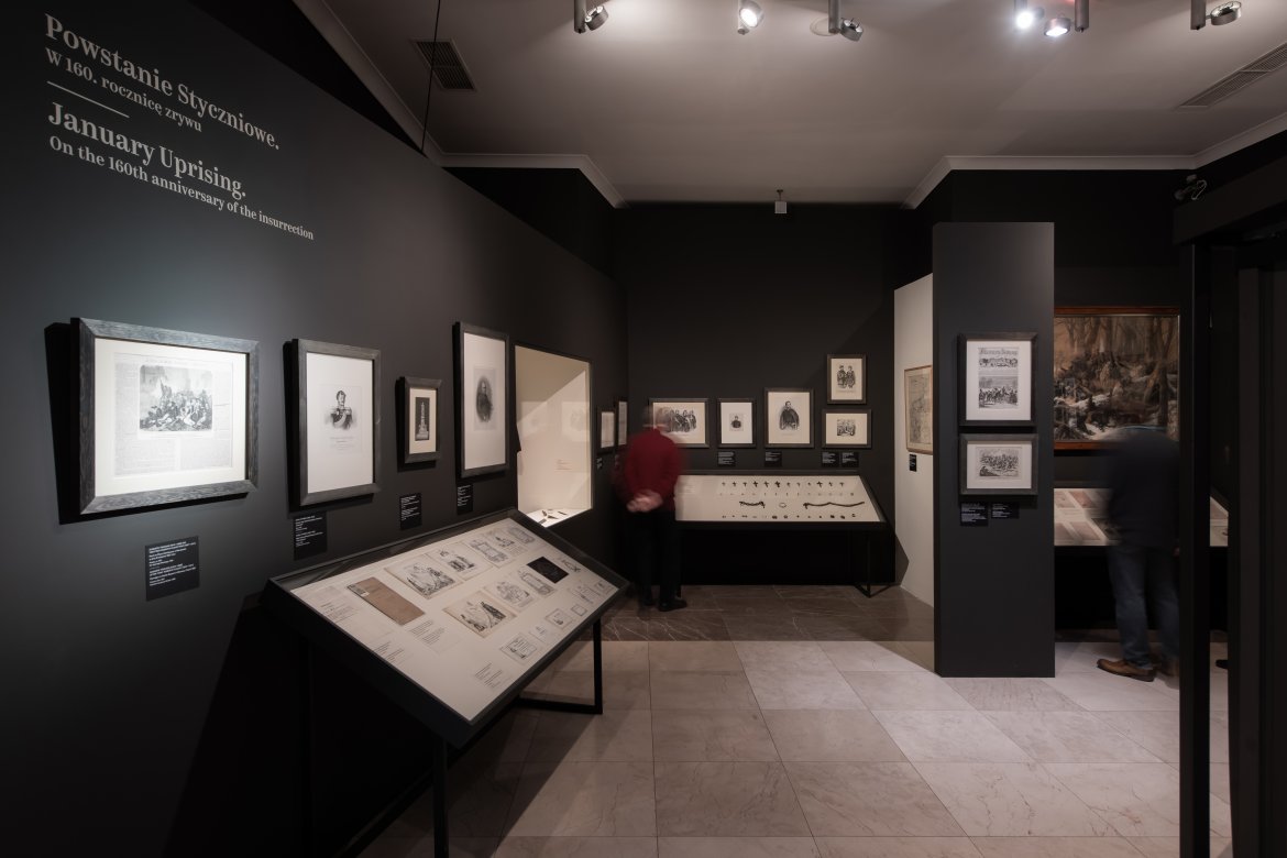
Exhibition “January Uprising. On the 160th Anniversary of the Uprising” presents a rich collection of memorabilia related to the period of the January Uprising in 1863.
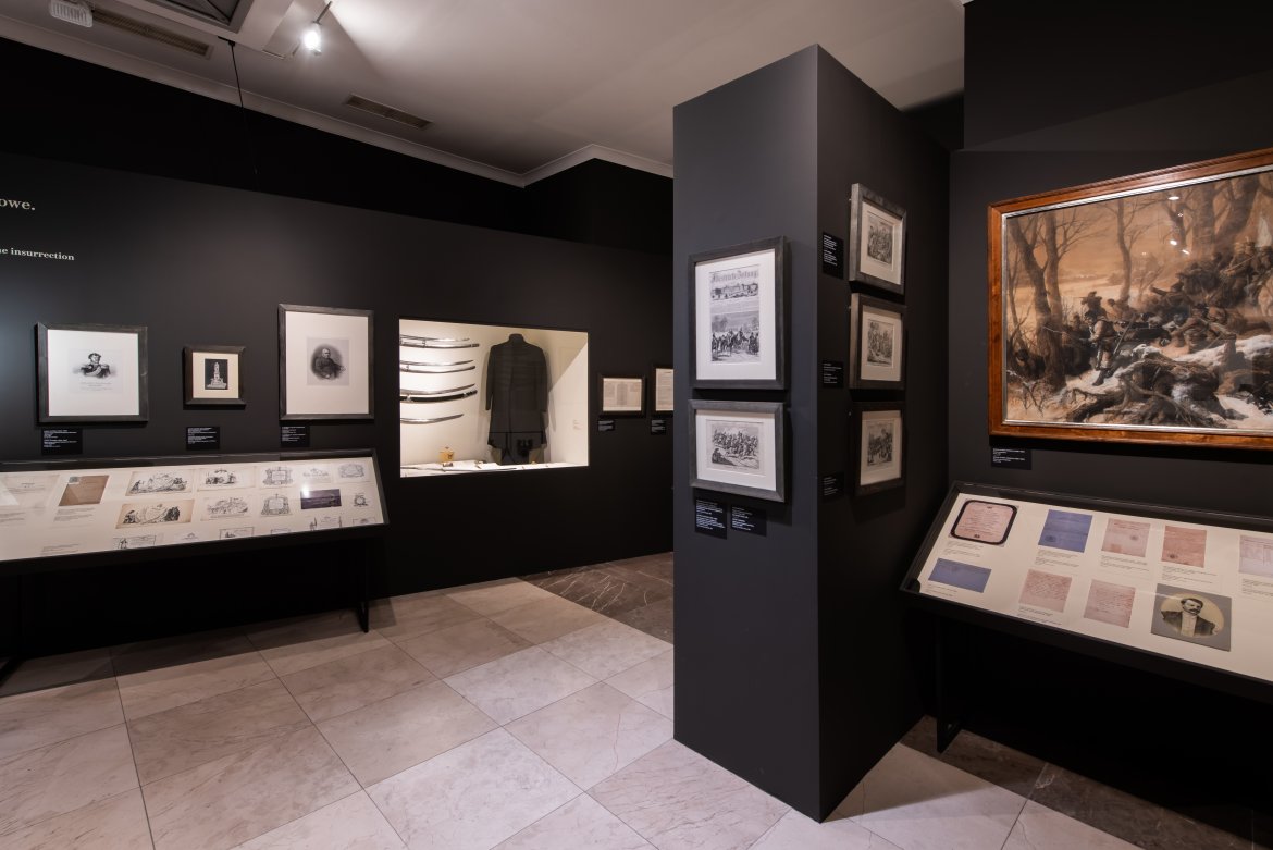
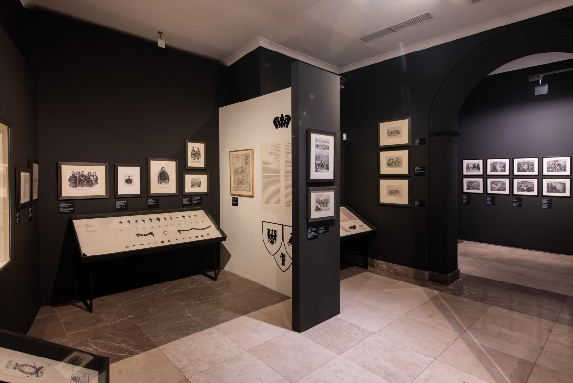
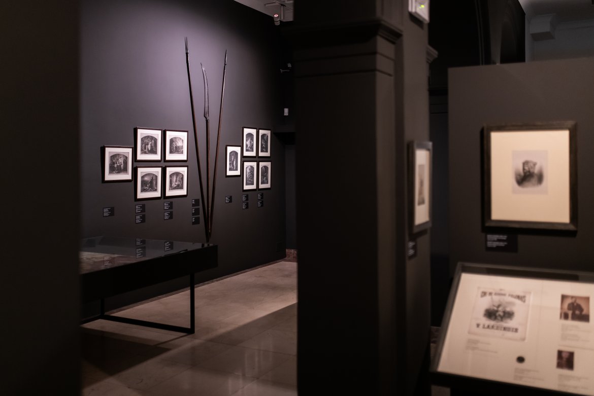
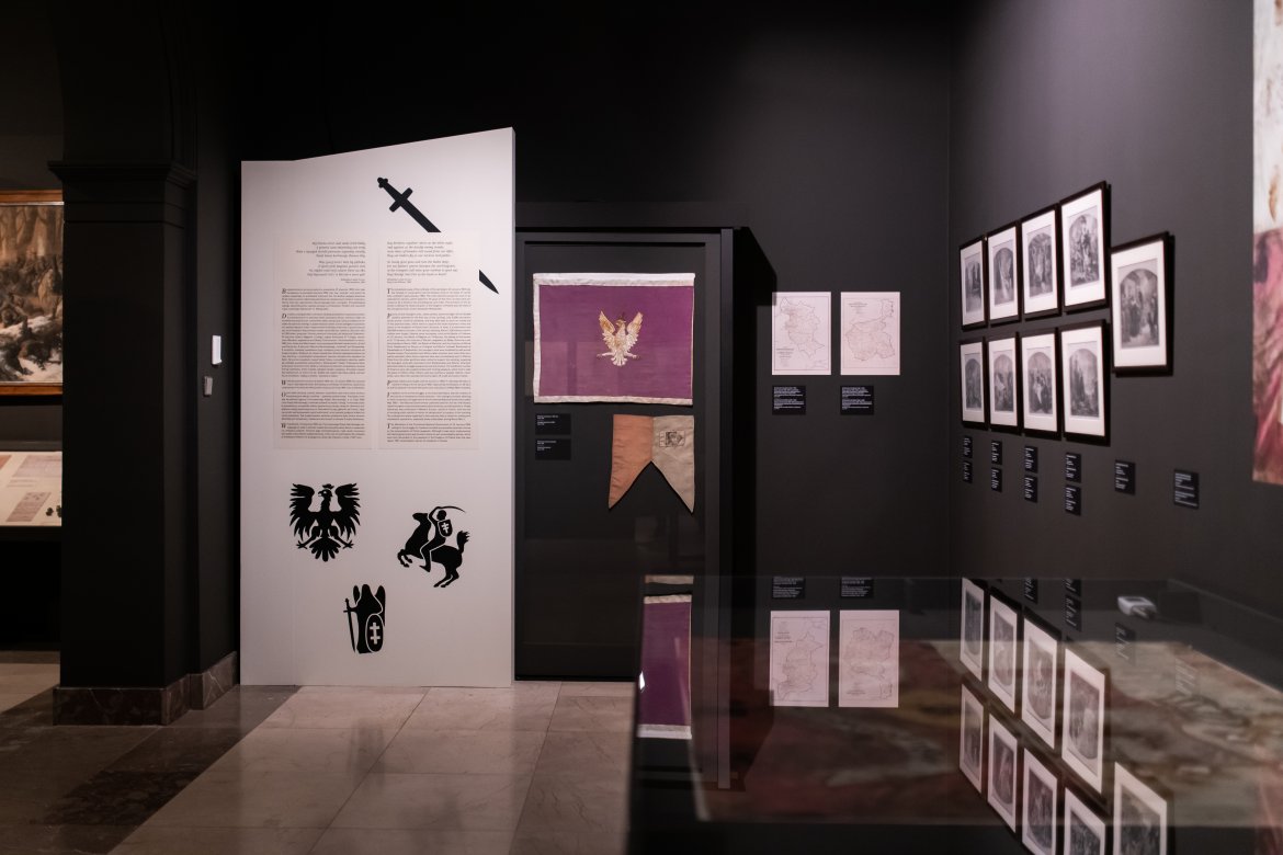
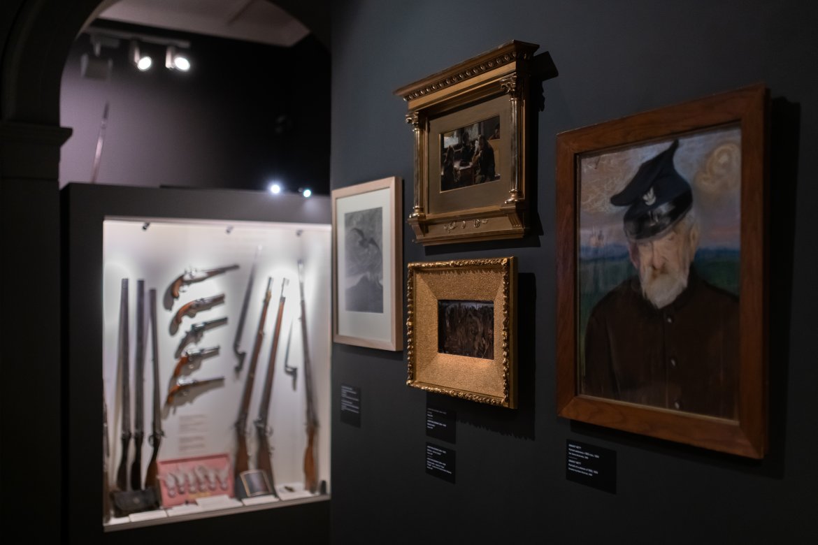
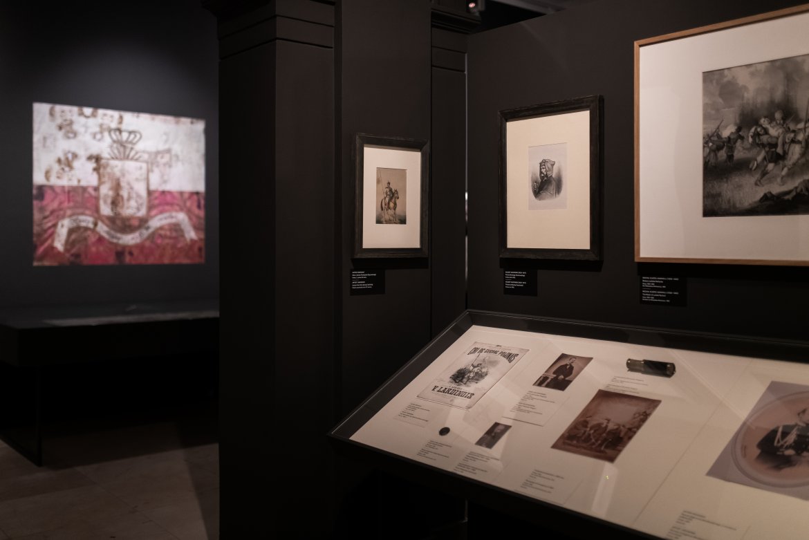
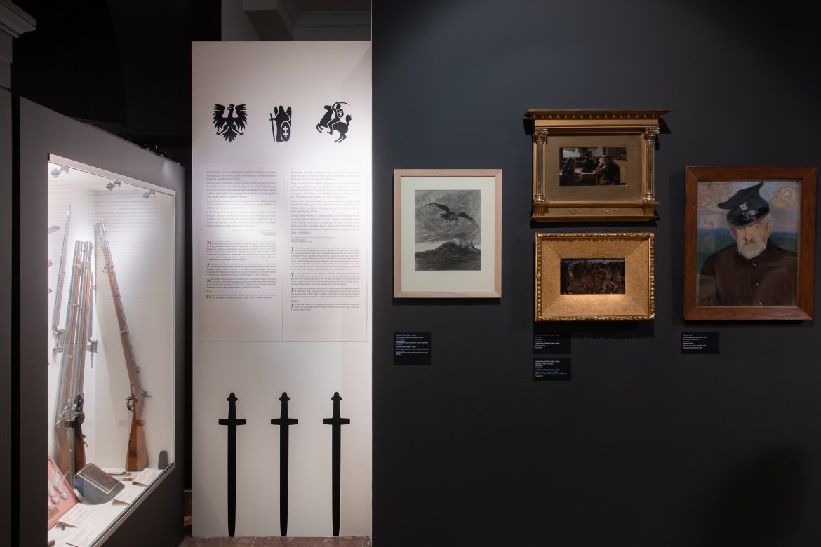
The exhibition space is an interior of a rather complicated character, with already existing walls that had to be used in a new arrangement. In order to visually clean the difficult space, a deep and warm gray color was introduced on the walls. For contrast and highlighting the most important content and objects, a light beige color was introduced. Subdued colors used in the exhibition emphasize the historical, sublime and nostalgic mood of the exhibition theme.
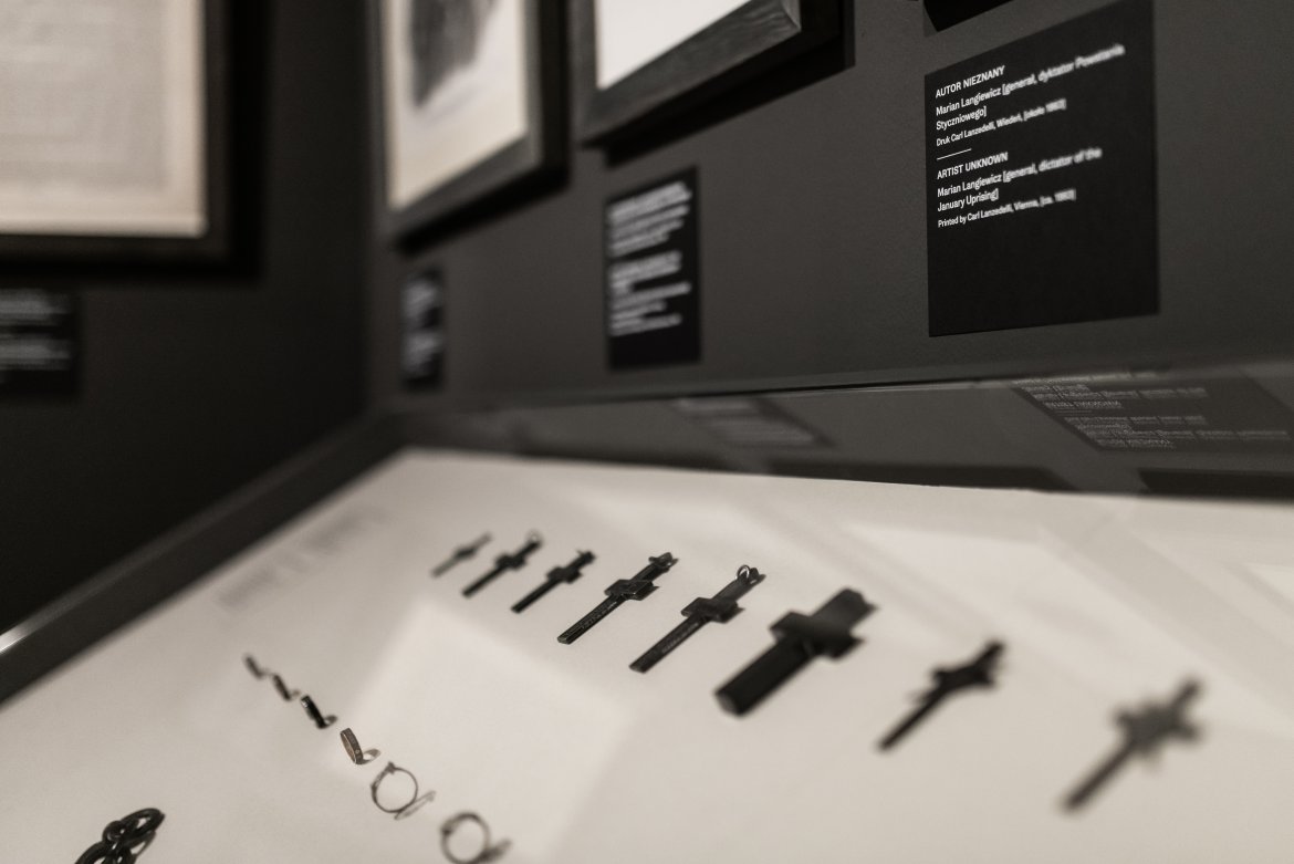
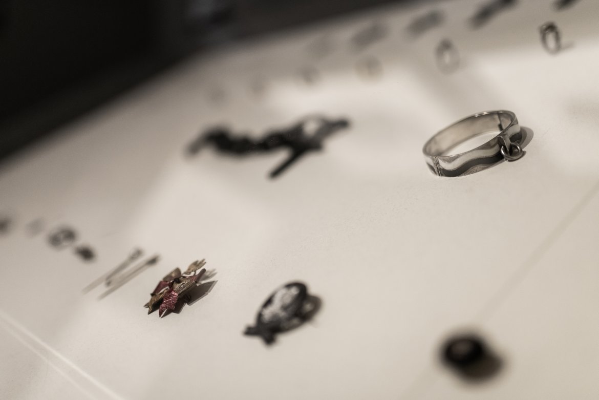
Historic and most valuable objects have been placed in desktop cabinets and in glazed niches. Larger historical memorabilia, such as flags, were also placed in display cases. The reverse of the most important of the banners was presented in the form of graphics on the wall above the original object lying in the display case. The color of the frames in which the graphics were framed was matched to the color of the walls.
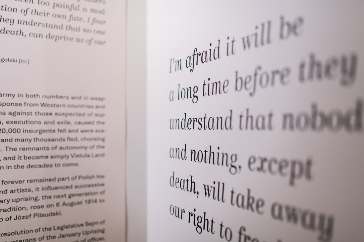
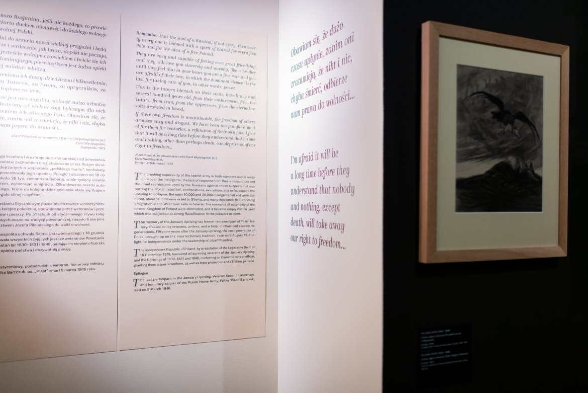
The exhibition also includes longer educational texts, presented against a light, beigebackground. They are accompanied by illustrations - graphically simplified symbols related to the January Uprising and corresponding to the content. Kazimir and Kazimir Text typefaces were selected for the composition of the texts at the exhibition. The serif, contrasting typeface visually refers to documents and memorabilia from the era. Thanks to the wide family, the typeface reflects the spirit of the times, in the basic (headline) variety, it is expressive and decorative, and the text variety allows for high readability of more extensive content with less handwriting.
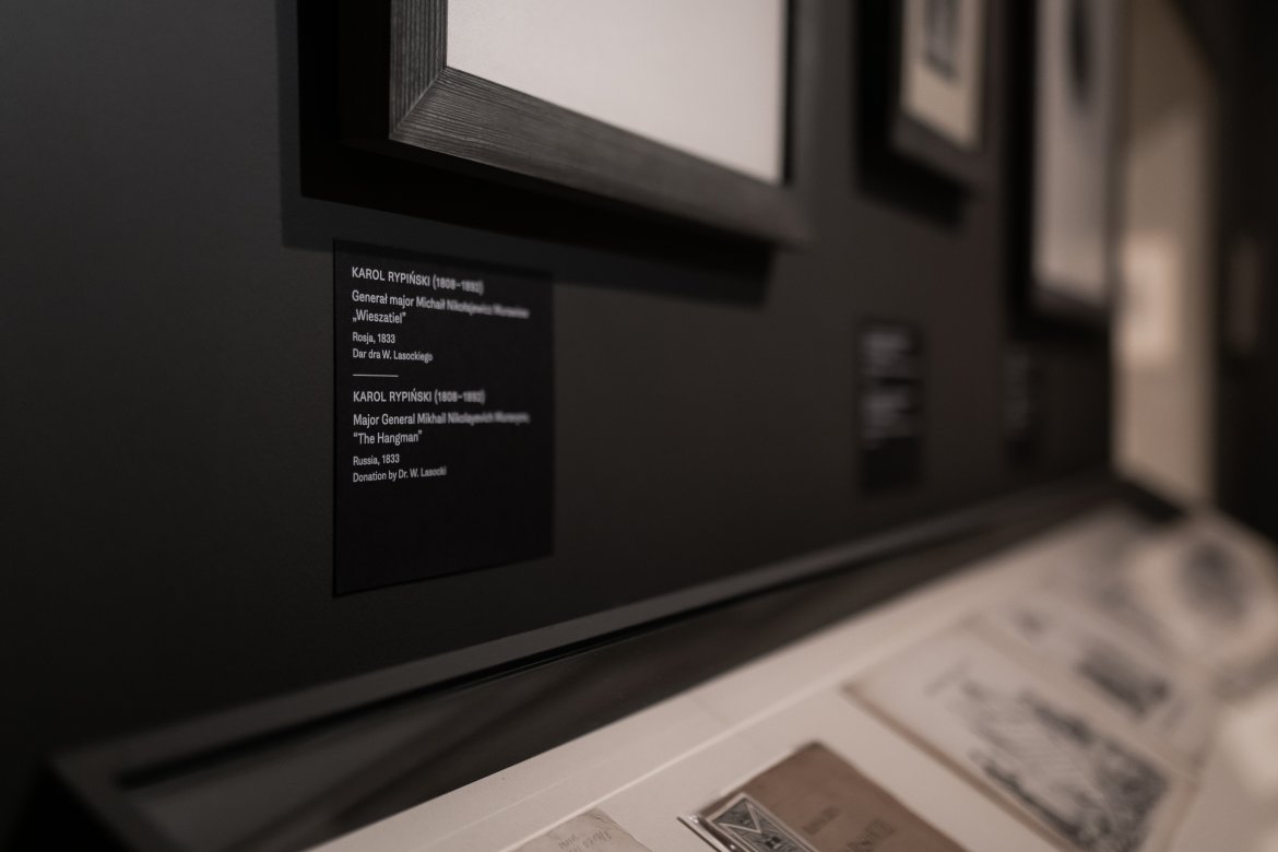
All texts in Polish and English are treated equally, separated only by a short horizontal line. The signatures of the dark version of the exhibits appear on the walls next to the exhibits, and the light version is intended for showcases with a bright interior.